When analysing markets and trying to predict future price action there are certain techniques and studies that I pay a lot of attention to (here and here for example). There are other studies, however, that I don't assign any great weight to but still look at regularly because they're, you know, fun and interesting. The pattern matching and price projection study I'll describe in this post falls into this category.
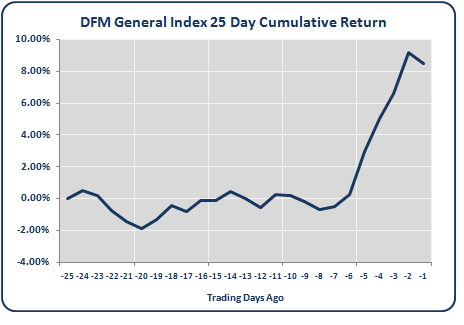
Here's how it works. Let's take the cumulative percentage return of the DFM General Index over the previous 25 trading days:
This 25 day price action can compared with all other historical 25 day periods for the DFM General Index. In doing so we can identify which past 25 day price periods most closely match the current 25 day price action (note: the matching algorithm I used has been adapted from the gummy-stuff.org website. It uses a Pearson correlation to determine the level of similarity between the current 25 day cumulative returns and the historical 25 day cumulative returns).
As an example, the chart below shows the current 25 day price return (dark blue line) versus the best historical 25 day match (light blue line):
As you can see, the cumulative 25 day return of the best historical match closely tracks the the current 25 day price returns. The smaller chart shows at what point the best historical match occurred on the DFM General Index. In this example the the 25 day period that most closely matched the current 25 day price movement was in September 2007.
Next, we can use the price action that followed the best historical match to make a price projection for the current market. The chart below shows three such price projections:
Rather than rely on the price projection of the single best historical match I've also included the second and third best matches. Each projection extends for 20 trading days into the future and is determined by the price action that followed the corresponding best match period.
For example, the dotted red line shows the 20 day projected price action, from the current market level, based on the price action that followed the best historical match back in October 2007. The dotted green line is another 20 day projection but based on the second best historical match (Jan 2005) and the orange line is the projection based on the third best historical match (Aug 2004).
The red, green and orange markers on the smaller chart highlight the three best historical match periods on the DFM General Index.
In the example above we can see that the price action that followed both the best historical match (dotted red line) and second best historical match (dotted green line) was bullish, extremely so for the best match. However, the price action that followed the third best match (dotted orange line) was bearish.
The rationale underlying this analysis is that periods of similar price action will also share similar future price action. Of course, the future is unlikely to unfold exactly as it did in the past. Nonetheless, it's informative to know how similar price movements to the one forming currently played out in the past.
In the next post I'll provide the price projections for other GCC indices based on this pattern matching analysis.
Let me know what you think.
Enjoy.
Thursday 16 September 2010
Price Projections Using Pattern Matching
Posted by
Peter Barr
at
07:00
Email ThisBlogThis!Share to TwitterShare to FacebookShare to Pinterest


Labels:
DFM General Index,
Dubai Analysis
Bookmark this post: |


